Most retro imagery draws from the period roughly between the 1920s and the 1980s, with a strong pull toward the 1960s and 1970s. The word retro itself comes from the idea of being retrospective — looking back — and that perspective is what turns these earlier decades into something worth noticing.
The bold graphics of posters, advertising, and signage from those years were never meant to be admired as art; they were designed to be clear, direct, and useful. Only later, when time created distance, did those everyday visuals begin to stand out and invite a second look.
Retro art is often described as a look, but it's more accurate to think of it as a way of seeing. It emerges when enough time has passed for ordinary life to feel separate from the present. Not ancient history, and not distant myth — just earlier times that people once moved through without thinking much about them. When those times no longer feel current, they become visible in a new way.
That shift in perspective is where retro art begins. A roadside sign, a travel poster, or a classroom chart becomes interesting not because it was exceptional, but because it belongs to a way of living that has moved on.
Visually, this is where familiar traits appear. Retro art often relies on strong, confident color palettes — mustard yellow, olive green, burnt orange, cream, teal, dusty rose. These colors feel warm and grounded, but also graphic and deliberate. Shapes are usually simple and bold: circles, arcs, checkerboard patterns, clean lines, and repeated forms. Typography tends to be rounded, playful, and easy to read, echoing the language of signs and printed materials.
Many of these elements trace back to design movements people may not recognize by name but instantly understand by feel. Mid-century modern emphasized clarity and function. Art Deco favored geometry and structure. Pop art brought everyday culture into focus. Retro art blends these influences naturally, without asking the viewer to know the history behind them.
Modern tools are part of the process as well. Most retro art today is created using contemporary techniques, even when it looks old. Digital illustration, AI-assisted workflows, and modern printing methods are often used to recreate the mood of vintage posters and advertising layouts. The goal isn't exact reproduction. It's familiarity.
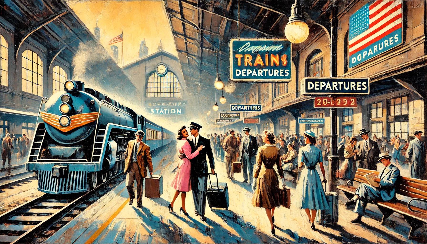
Subject matter plays an equally important role. Retro art often returns to scenes that feel broadly recognizable: travel posters advertising coastlines and highways, surf culture and leisure, botanical illustrations, and oversized florals. Childhood memories surface too — school posters, diagrams, and designs that once hung quietly on walls.
These images don't depend on personal nostalgia. You don't need to have lived through the 1960s or 1970s to respond to them. The appeal comes from shared experience and collective memory. The scenes suggest a slower pace and a clearer visual order, offering contrast to the visual noise of the present.
That's why retro art tends to feel calm rather than loud. It doesn't argue that the past was better. It simply shows how earlier times looked while they were being lived. The meaning arrives later, once enough distance exists to notice what once went unseen.
In the end, retro art is about perspective. It reminds us that what feels ordinary now will one day be looked at the same way. The present eventually becomes something to look back on. By being retrospective — by looking back — retro art makes earlier times visible again, not as history lessons, but as lived spaces that still carry meaning.
All art and text copyright © 2025 Retro Art World. All rights reserved.